So how close are we?
So how close are we?
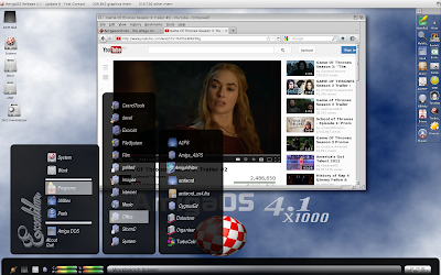
I done lots of work on fine tuning and improving the code, many small visual improvements that I hope will make it easier to make nice looking themes for Excalibur, what we have her is a improved black theme, whit a logo made by Bjørnar, it show some of new features that is important for DjNick mockup.
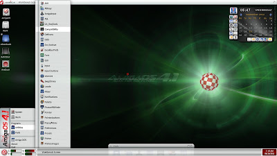
There are some complaints that is coming from some of you that DjNick mockup is too windows like, but its just a theme, Excalibur is not one form factor, you decide how its going to look how many buttons, what is going to be shown, the idea is that is customizable in looks, so you make look as just as you want (whit in limits of the program).
So what is new, as you can see fonts can be changed in style and size, the menu selector is a transparent bitmap, the menu divider is bitmap tiled or scaled to fit the menu perfect, the program tries to be smart about it, a number of graphic glitches has been fixed, due small disk crash I head to do it twice, so it was almost ready a month ago, but did take me a extra month, due the crash, what is left is going over etch theme and fix and compatibility issues new prefs, some of settings has changed names, so this has to be fixed.
I have long list of ideas in my head, and there are a lot of things that is on the TODO list, but most of graphical stuff is done, might might be effected by changes in other parts of the code, its always a on going processes, where you changes some thing and it effects an other parts, and every thing has be tested.
I also include DjNicks mockup so you can compare.

