A word on project synergy
Outlining my programming activities in the previous blog post I also mentioned that I had been involved with the Amiga Developer project for quite some time. After the post went live a few people asked me whether it meant that I would work less on the project now that I develop my own software. The answer is no, not really. In fact, there is a good deal of synergy between Rear Window and the work I do for Amiga Developer, and the two efforts have benefited from each other.
I for sure am biased because of my personal stake, but I’ll say that one of the better things the Amiga Developer initiative has produced is the Enhancer Software Core classes: a free collection extending the standard GUI toolkit provided by the operating system. Indeed, the main reason why I like to promote the Core is because it brings new possibilities to Amiga GUI programming. So when I started working on my Rave audio editor, I knew I wanted to use the new classes on top of the traditional ones. What I didn’t know was that Rave would soon become an important test bed, a trial of fire in which the Core classes would have to prove themselves.
Regardless of how thoroughly you design it, a software component only reveals its true colours when used in real software. By which I mean not only that real-life use exposes bugs and drawbacks that went unnoticed at design stage or during beta testing. Actual use in software also tends to throw new light on how the component could work and what features might be missing. I’ll hazard a guess that a lot of the AmigaOS gadgetry has seen progress because a developer working on particular software was short of a particular feature. Or is it pure coincidence that the GUI toolkit received major updates while Simon Archer, one of the key OS developers, was working on his CodeBench IDE suite? I don’t think so. And that’s just one case in point.
Having access to the Amiga Developer source code repository I was, similarly to Simon, in the lucky position that I could shape the classes I’d decided to use in my software. As a matter of fact, all of the recent updates I have made to the Select Gadget (originally written by Massimo Tantignone) and the InfoData Gadget (Mark Ritter) were motivated by something that cropped up while I was working on Rave. And it won’t come as a surprise that my audio editor is also directly responsible for the very fresh addition to the Enhancer Software Core: the ToolBar Gadget class, which I have recently covered for the Amiga Developer Blog. Here’s how it all came about.
I have a habit of starting my projects by designing the GUI. Although in the end it usually bears little resemblance to the original version, I prefer to do it this way because seeing something tangible on the screen jogs my creativity. (It also tricks me into feeling a sense of accomplishment, despite the fact that the program doesn’t do a thing yet.) So I was sitting there designing an early toolbar for Rave when I once again realized how much I hate the standard SpeedBar Gadget, because it takes ages to set up. In an ensuing act of bravado I decided to put the work aside and write a custom toolbar gadget class: one that would be basic in features but extremely easy to get going. I thought, few programs use their toolbar for more than triggering action, so why not focus on the primary function? It turned out to be a relatively quick job, and it would have remained a one-off affair (and I would have no article to write now) if I hadn’t made a classic mistake: I shared my work with others.
In a way, I shot myself in the foot by offering the ToolBar Gadget as a contribution to the Enhancer Software pack. I fell prey to semantics, not realizing that if something is called “Enhancer”, people will invariably expect more features from it. Well, my gadget class didn’t have more features than the SpeedBar, it just represented a simpler alternative – which apparently didn’t come across as added value. The subsequent reactions ranged from indifference to downright scorn, and they were a painful lesson to learn. One fellow developer kindly sent a list of features my class absolutely needed to have before he even bothered to use it; isn’t team spirit great? But we Amiga programmers are renowned for our resilience (on top of the fact that we can cook a decent curry, which puts us in constant demand at registry offices), so I didn’t give up that easily and continued working on the class alongside the Rave project. This turned out to be a very sensible decision because as the program evolved, so did the ToolBar Gadget in response to my growing needs. Thus one feature led to another until one fine day (whew!) I finally felt that my dear little creation could no longer be blamed for not enhancing the Enhancer enough.
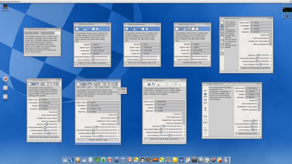
A brief look at the screenshot above may suggest that there is little visual difference between the ToolBar and the old SpeedBar. And yes, when the ToolBar Gadget saw its first public release, a few users seemed disappointed that the two classes didn’t look any different. On closer inspection, however, you’ll notice certain details that go beyond the default look and hint at the advanced configurability of the ToolBar. Most prominently, the new class features a borderless mode, which arguably looks more modern and helps reduce clutter in crowded GUIs. There are also smaller and less conspicuous improvements such as support for multiple image sets (and easy switching between them), adjustable inner padding of the toolbar buttons, or configurable style of the separator bars.
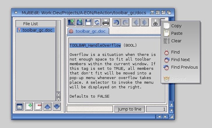
One feature I’m really proud to have implemented is overflow handling. What is that? Well, some toolbars can be quite long and take up a lot of space in the program window, which may complicate use (especially where screen estate is limited). Therefore, toolbar classes are typically designed as “collapsible” GUI elements, to allow shrinking the window to a smaller size. When the window becomes too small to fit all of the toolbar members, we get a situation called overflow. How this situation is handled depends on the particular class. For example, the SpeedBar Gadget employs a scrolling mechanism that is triggered by holding the SHIFT key and then dragging the mouse left/right (or up/down if the gadget is vertically oriented). I’ve always found this behaviour rather quirky and unintuitive, so I preferred a smarter solution. As the image below shows, the ToolBar Gadget reacts to overflow by displaying a selector button on the right. Clicking on the selector invokes a pop-up menu the individual items of which correspond to the toolbar members that are currently out of view. So even in a minimum-sized window it’s really quick and easy to access the program functions. (Potential naysayers will be happy to know that overflow handling is optional, so if you prefer to have a “static” toolbar that is always displayed in full, you simply don’t turn the feature on.)

Having finally released the updated ToolBar in October 2020 I though I’d give the Enhancer classes a rest for a while and fully concentrate on my audio editor, but as every seasoned programmer knows – man proposes, software disposes. Soon after I got down to business, working on Rave provoked another idea. Now, unlike in other spheres of human activity, ideas in programming can be really dangerous because they often lead to feature creep and, ultimately, projects that never get finished. Large software companies even hire professional hunters to locate staff programmers with ideas and shoot them on the spot. But as a humble freelancer I didn’t need to worry, and because the Christmas period promised some extra free time, I decided to have one more go at the ToolBar Gadget. So, what was this idea about?
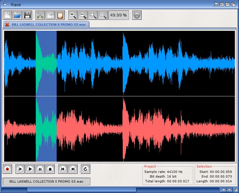
Well, the main program toolbar in Rave contains a section with buttons that control the zoom of the waveform display. Originally I had the current zoom level indicated in the status bar at the bottom of the GUI, which was OK but somehow didn’t feel right. From the viewpoint of user interface design, I believe that if a GUI element controls a particular value, the value should preferably be displayed in the proximity of the controlling element, to have clear visual correspondence between them. So I started thinking: what if the zoom level value were displayed in the same toolbar section, i.e. next to the zoom buttons, rather than somewhere far below in the status bar? Of course, the ToolBar Gadget wasn’t exactly up to this: you could create a text-only button, you could even change the text on the fly, but it would still look and act as a button. What I needed was a new type of toolbar member, a read-only display area streamlined for dynamic text content. Luckily, the internal design of the gadget allows me to add pretty much anything (as long as it’s a BOOPSI object), so before the New Year chimed in I had the textbox member type ready and on the job. This is what it looks like in the current development version of Rave:
For good measure I also threw in support for colours and text styles, because it was clear to me that someone would ask for these features sooner or later. Now that I’m thinking about it, in the end I must have made the ToolBar one of the most versatile and configurable classes of the entire AmigaOS4 BOOPSI set. Why do I suddenly feel so tired?
All right, it’s getting long (and late), so time for some closing words. An old Slavic proverb says that you can’t sit on two chairs at the same time. And there’s a good deal of truth in it: working on two simultaneous projects often means that one will rob the other of your time and focus. On the other hand, projects can also inspire each other, grow together and produce a synergistic effect between them. This has worked very well for me: both the Enhancer classes and the Rave audio editor have greatly benefited from the synergy. I’m quite sure there will be more in the future. And I’ll be here to tell you, so keep an eye on the Rear Window!

